| Latest topics | » help regarding old forum
 by Dr.Yuri_Taeko Wed Aug 17, 2022 7:29 am by Dr.Yuri_Taeko Wed Aug 17, 2022 7:29 am
» Tokyo Mew Mew reboot anime series
by Sakuranbo Mon Jun 13, 2022 12:54 pm
» Magical Girl Fandom Rivalries
by Dr.Yuri_Taeko Wed Nov 17, 2021 8:05 pm
» Petite Princess Yucie/Puchi Puri Yuushi
by Sakuranbo Thu Nov 11, 2021 1:57 pm
» Tonde Buurin / Super Pig
by Sakuranbo Thu Nov 11, 2021 1:52 pm
» Dragon Ball Super VS Sailor Moon Crystal
by Sakuranbo Thu Nov 11, 2021 1:24 pm
» What are you watching right now?
by Sakuranbo Thu Nov 11, 2021 1:13 pm
» Otome Games
by Sakuranbo Thu Nov 11, 2021 1:10 pm
» Anyone Actually Watching Crystal?
by Sakuranbo Thu Nov 11, 2021 12:13 am
» Sailor Moon Speedy dub
by Sakuranbo Thu Nov 11, 2021 12:08 am
|
| Who is online? | In total there is 1 user online :: 0 Registered, 0 Hidden and 1 Guest
None
Most users ever online was 288 on Thu Sep 30, 2021 8:06 pm
|
| | | Author | Message |
|---|
Silent_Magical_Girl
Civilian


Posts : 40
Coffee Beans : 48
Join date : 2015-07-02
Age : 29
|  Subject: Color design trouble Fri Jul 10, 2015 2:25 am Subject: Color design trouble Fri Jul 10, 2015 2:25 am | |
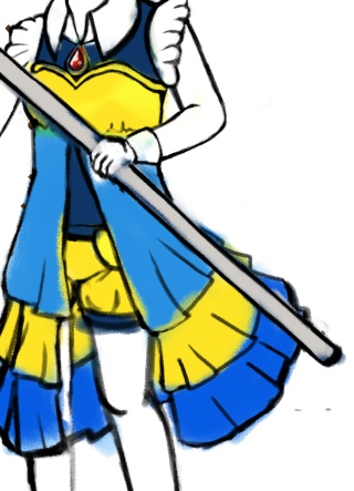
| Oh gosh, why color designing is so hard?! Especially when throwing colors on a magical girl's costume/dress? I almost wanted to flip a table.   I am so frustrated that I spent many, many senseless hours on finding a right color. I have been stuck with the costume for few weeks. I used red, blue, and yellow at once few times, and it was almost like the palette of Disney's Snow White. I want to get bit more blue and yellow with a hint of red, like 2# from below this picture. However, I still feel something is missing. The main color theme may be blue, but it is more tricky when adding a hint of red on any palette which is an important color that sparks to the magical girl theme. Red should be not so gruesome because it is actually related to little blood drop for some reasons. *SIGH* I will explain later about the blood when the entire design is finished. I promise it won't be horror related or bloodbending whatever, ha ha.  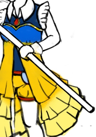 So... this is the final rough palette (2#) so far I have created all after these troubles. Thoughts? Any few words can be so helpful.
Last edited by Silent_Magical_Girl on Sun Sep 27, 2015 1:35 am; edited 1 time in total |
|   | | Chat de la Lune
Cafe Cat


Posts : 1092
Coffee Beans : 11249
Join date : 2013-10-06
Age : 38
Location : Lost in the Labyrinth
| | Subject: Re: Color design trouble Fri Jul 10, 2015 6:05 am | |
| try a dark almost forest green to balance the colors out, just as an accent. if the dark doesnt work you could try a lighter maybe mint green to offset. and to look less like snow white try having the yellow on top and the blue on bottom maybe even switch the colors and have blue be the more dominate color. also i was thinking about it that maybe a blue green might work too. looks good!  |
| | | | Silent_Magical_Girl
Civilian
Posts : 40
Coffee Beans : 48
Join date : 2015-07-02
Age : 29
| | Subject: Re: Color design trouble Fri Jul 10, 2015 4:03 pm | |
| |
| | | | Chat de la Lune
Cafe Cat
Posts : 1092
Coffee Beans : 11249
Join date : 2013-10-06
Age : 38
Location : Lost in the Labyrinth
| | Subject: Re: Color design trouble Fri Jul 10, 2015 10:51 pm | |
| all look great! I like the top right one, you could add your red accent on the short instead of the blue and on top of the bodice where it's gold maybe a red gold? the bottom left is appealing too maybe try putting the red on the dress where the yellow is it might work for you, and i'd but that same red alone the hem of the shirt under the dress where the shorts meet the top, it would add a division of the two.
Im glad i could help and its nice to help with all these years of color study behind me. seems they're finally paying off ^^ happy drawing! |
| | | | Silent_Magical_Girl
Civilian
Posts : 40
Coffee Beans : 48
Join date : 2015-07-02
Age : 29
| | Subject: Re: Color design trouble Sun Jul 12, 2015 12:06 am | |
| Do you mean like this?  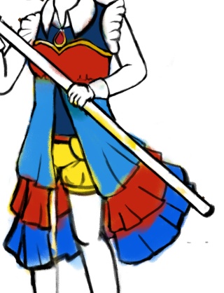 Thank you so much for your help. Honestly, I don't seem like I understand how color designing works, even I know a bit about the work of color wheel and dark/lightness. Too many black/white drawings for me, ha ha. I think I like the combination yellow/blue more. (darn google image search for blue/gold dress) It feels so gentle for the character and the theme. Blue/red/yellow is not just all about Disney's Snow White, huh? It also seems interesting on a magical girl design. Thank you so much again! To be curious, what's your favorite magical girl color? I like how the sailor guardians' color are not just single color, like Jupiter's and Venus'. My artist friend admires Sailor Pluto's color because of the amount of deep maroon, dark skin tone, and beautiful, dark green hair. |
| | | | Beat
Hostess


Posts : 268
Coffee Beans : 715
Join date : 2013-06-29
Age : 36
Location : Unprotected dimension-Laxton city
| | Subject: Re: Color design trouble Wed Jul 22, 2015 12:43 pm | |
| I just LOVE THE LAST ONE! That golden color just screams Stars! but one of the advices I'd like to give is that you don't just choose color. Take into account many things, villains, rivals ect. As I see it, Hoshi is a star, and the enemies by default would be black as in "starless sky" though, I' see this pretty redundant, also you said Hoshi would have a Rival, if choosing the last one, the rival could be amped up in silver as a folly to her.
Stars have different colors and meanings, I'd suggest mixing the "black" theme with maybe red dwarfs, supernovas ect to have a color meaning for every villain, in such a case, the 3rd one looks more useful. Like I said it all depends on what color and what color would the villains have.
Read you later, hope you keep up the work and creativeness! |
| | | | Silent_Magical_Girl
Civilian
Posts : 40
Coffee Beans : 48
Join date : 2015-07-02
Age : 29
| | Subject: Re: Color design trouble Wed Jul 22, 2015 4:25 pm | |
| Thank you, Beat. Actually, this “snow white” character is for another magical girl series else than my old original story with Starla/Hoshi. It is still really great idea about the golden color resembles stars.
I wanted to make few magical girls with chronic disease/conditions shared as mine. Then it became a great motivation for future drawings. It is a wonderful dream where making a comic including the chronic condition that can reduce stigma from the real world. I can’t count how many times the condition gets shamed. It was literally misunderstood by a well known company with its ignorant words weeks ago. No wonder why I wanted to create strong magical girls with chronic conditions.
About the color, the yellow/blue is the closest way to tell the chronic condition's background. No wonder color designing with such a colorless thing is so hard. Recently, I am cleaning up lineart and slowly adding the color. I know I have been not so active for weeks due to job, college class and exhaustion, but I cannot leave this wonderful concept that easily. I am sure I will reveal the magical girl and her background including the chronic condition soon.
Thank you so much for your helpful advice on the meaning of colors based on those kind characters. That's kinda why I named Starla's civilian name "Azure" which is the meaning of cloudless blue sky. It is bit close to the way of juxtaposition. I used dark purple often on Starla's rival. I don't know why, but it is the opposite of blue in close way. Ah, space is such a wonderful thing. I must improve my researching skills on the universe more.
Thank you so much for the support. <3
Last edited by Silent_Magical_Girl on Wed Jul 22, 2015 4:33 pm; edited 1 time in total |
| | | | Chat de la Lune
Cafe Cat
Posts : 1092
Coffee Beans : 11249
Join date : 2013-10-06
Age : 38
Location : Lost in the Labyrinth
| | Subject: Re: Color design trouble Wed Jul 22, 2015 4:29 pm | |
| personally i like yellows an blues with hints of pink on some and on others i like a deep red tones with white accents. Kai is done with white and red. I hope you don't mind but i when ahead and made a visual of what i was trying to get at with your colorings. Both have really small changes.   Blue and gold are a great combo too. once you have your main colors it's finding the accents that work best with them for the character and then the eye. |
| | | | Silent_Magical_Girl
Civilian
Posts : 40
Coffee Beans : 48
Join date : 2015-07-02
Age : 29
| | Subject: Re: Color design trouble Sat Aug 08, 2015 3:54 pm | |
| Thank you Chat de la Lune for the visual coloring. I don't mind that. I know I have been not so active around this summer. I have some interesting topics to talk on the forum. Actually, I have been giving myself a break away from my original magical girl characters. I didn't realize how it mentally overwhelmed me already when I was in middle of making up a character with my chronic disease. I hope getting the mood again to write down her character background with finished drawing. I want to thank you for a lot of the help. For this, I will show another final coloring preview including below-light now. Thank you.  |
| | | | Chat de la Lune
Cafe Cat
Posts : 1092
Coffee Beans : 11249
Join date : 2013-10-06
Age : 38
Location : Lost in the Labyrinth
| | Subject: Re: Color design trouble Sat Aug 08, 2015 9:59 pm | |
| |
| | | | Beat
Hostess
Posts : 268
Coffee Beans : 715
Join date : 2013-06-29
Age : 36
Location : Unprotected dimension-Laxton city
| | Subject: Re: Color design trouble Sun Aug 09, 2015 1:44 am | |
| - Silent_Magical_Girl wrote:
- It is bit close to the way of juxtaposition. I used dark purple often on Starla's rival. I don't know why, but it is the opposite of blue in close way.
Well if Starla is blue sky "Aosora"  Purple can be "Kumotta yozora" or Cloudy Night sky, many times it can have a purplish tint in contrast the happy blue sky. For the special move line up...well it's all up to you! I can be of help or Mew Ami and Chat de la Lune can be too. It's all up to what you want the theme about. Anyway, Keep working, I want to see where this leads to the end! good luck! |
| | | | Silent_Magical_Girl
Civilian
Posts : 40
Coffee Beans : 48
Join date : 2015-07-02
Age : 29
| | Subject: Re: Color design trouble Sun Sep 27, 2015 4:59 am | |
| Thank you so much, Beat. I see the purple makes sense in this way. Actually, I don't have that much information on Starla's rival, but I had a lot of fun drawing her rival because of the mask and epic long cape. Kinda like Zorro. How funny for someone masked next to a magical girl didn't bother to hide her face like this. |
| | | | Sponsored content
| | Subject: Re: Color design trouble | |
| |
| | | | |
Similar topics | |
|
| | Permissions in this forum: | You cannot reply to topics in this forum
| |
| |
| |